The new and improved Explori Dashboards allow you to do a lot more with your data. The Dashboards are fully customisable, allowing you to visualise data to your specific needs. Below, we will show you how to create your own dashboard.
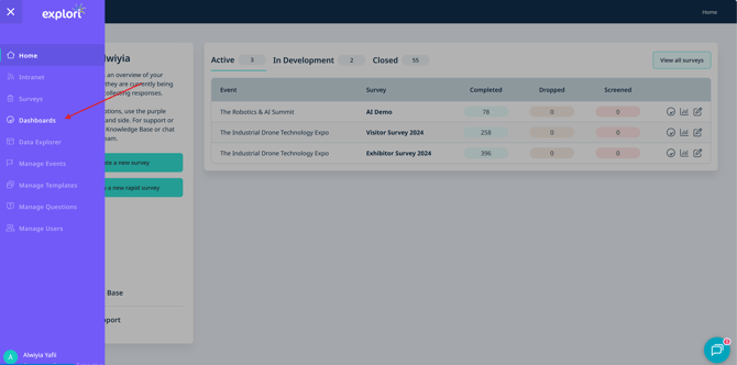
First, head to dashboards via the menu.
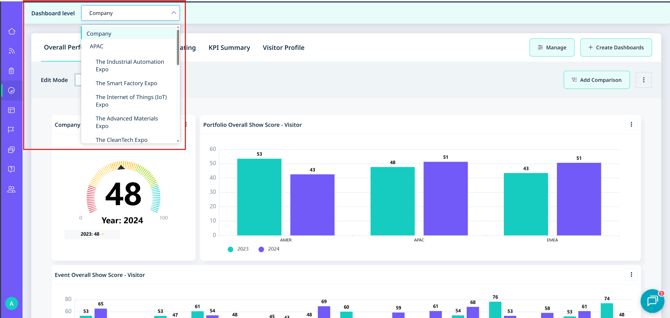
Choose your dashboard level
Select the level of dashboard you would like to create on the top right. You can create a Company, Portfolio or Event Level dashboard. For event or portfolio, select the event/portfolio you would like to create the dashboard for. Once the dashboard has been created, you can also make it a template and apply it to all dashboards of that level.
On the top right, select ‘Create Dashboards’ and name the dashboard. You can select a template to work from one of the dashboards we have created. In this case, we will be starting from scratch.
Create your widgets
Add your first widget to start. You can add a widget which is question based widget or from other measures.
A question based widget is formed from question responses. Other measures are not necessarily formed from questions, such as Email Response Rate, a KPI Chart and the Loyalty Satisfaction Matrix.
We will start with a question based widget.
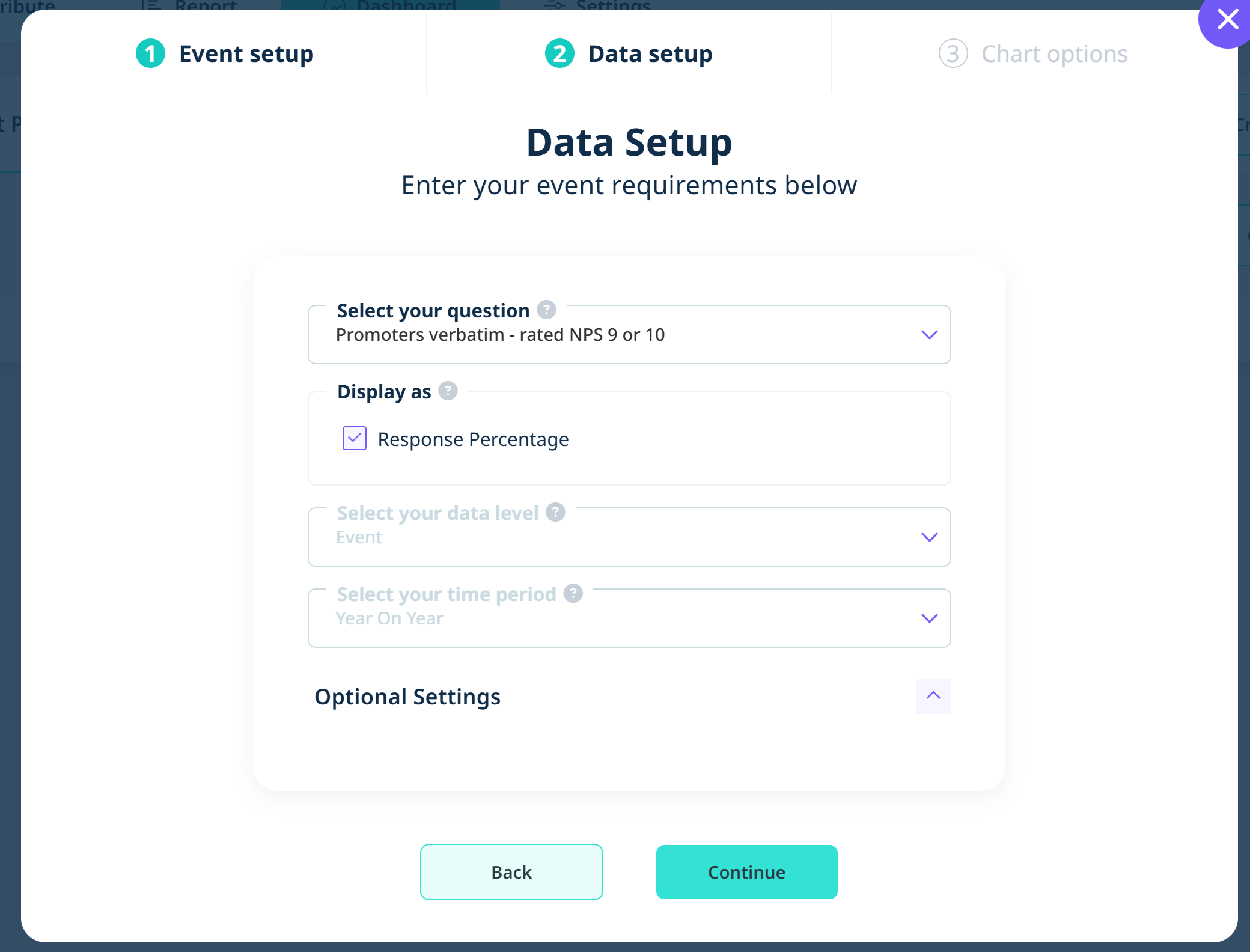
Fill out the event set up details:

On the next step, fill out additional details about the widget you are looking to create.
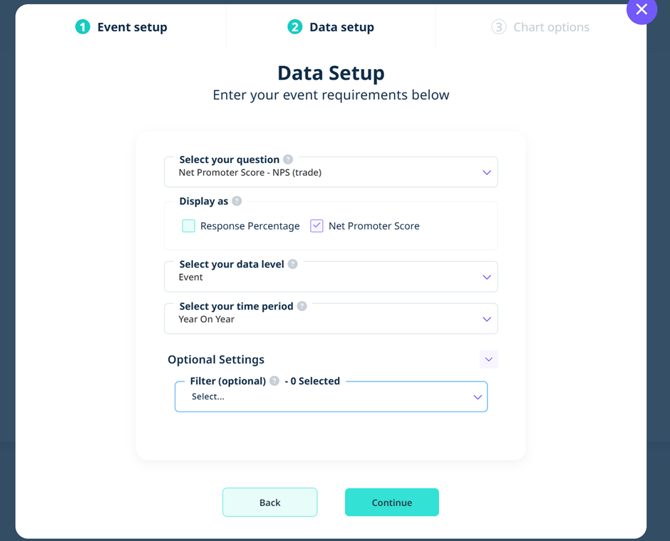
First, select the question you’d like to create the widget from. For this NPS example, you can choose to display the data as a percentage or NPS Score.
The NPS Score will be displayed at event level on a year on year basis.
Additional filters can be added to filter for specific events. We will leave this blank for now.
Customise your widget
Then continue to start setting up the appearance of the widget.
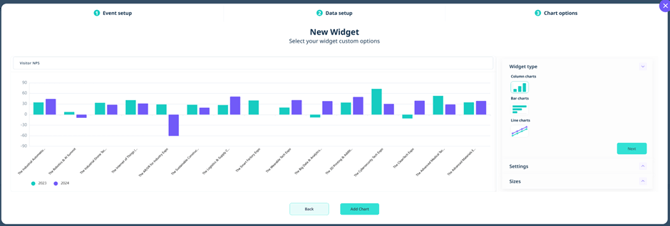
Name your widget at the top.
You can then choose the type of chart you would like to display.
In the settings, you have many different options that you can play around with including adding legends, labels, changing colour options etc.
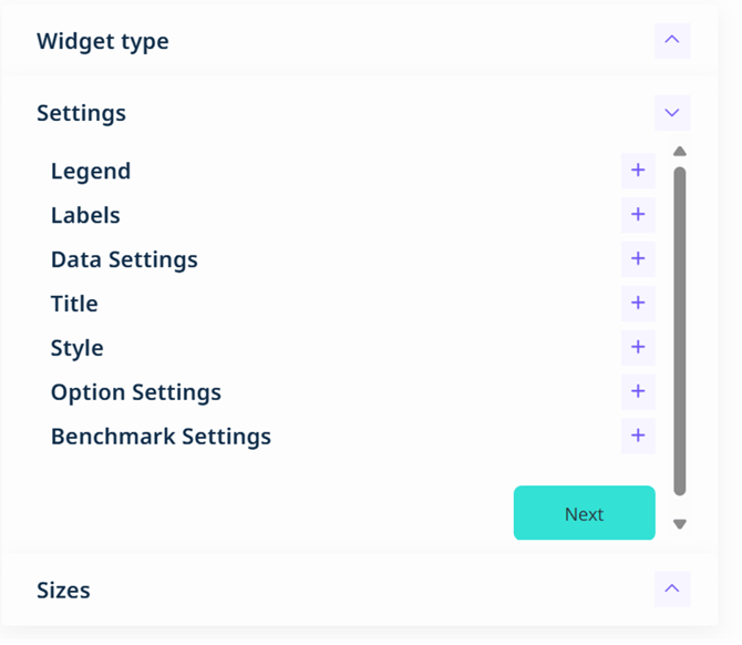
The chart will update with each setting you change, showing you how the data will display.
You can also choose the size of the widget. Once you are happy, ‘Add Chart’ at the bottom.
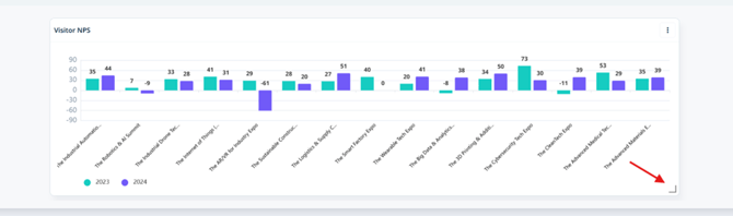
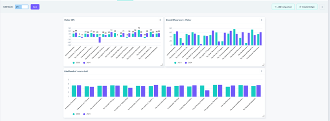
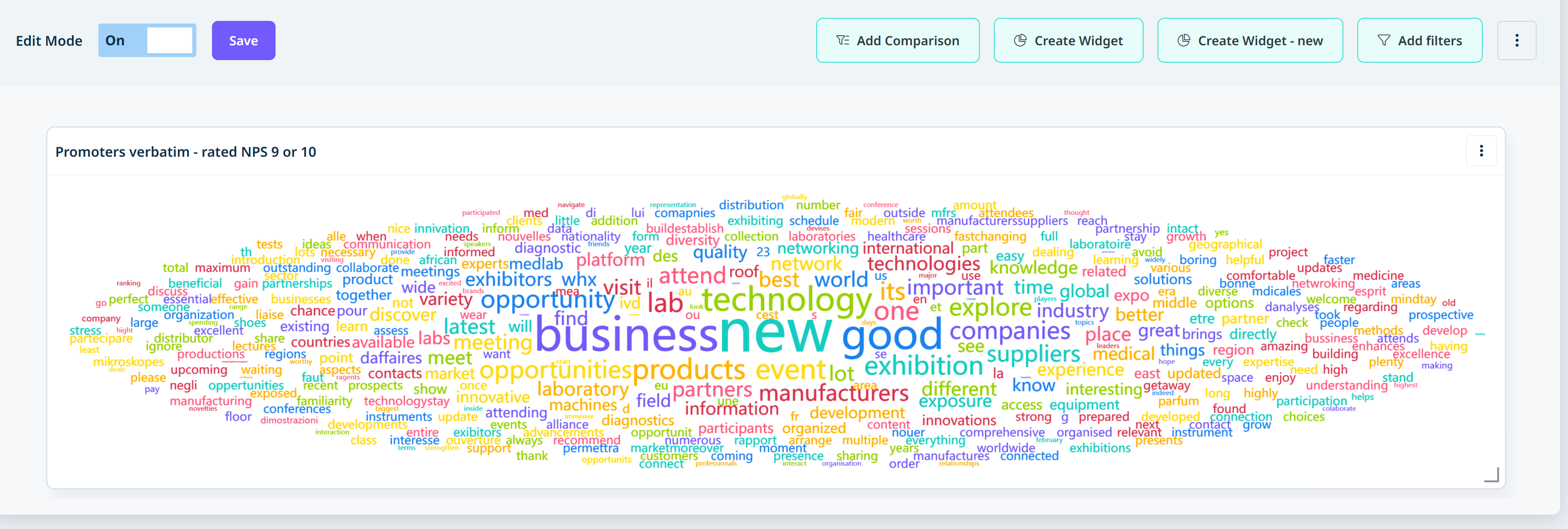
You can use the corners to resize your widget on your dashboard. Once you are satisfied, you can continue to add all of your widgets and then save the dashboard on the top left of the screen.
Using open text widgets
1. Select the Question based option in the widget creator
2. Input the details of the event setup
3. Select your open-ended question in the drop-down
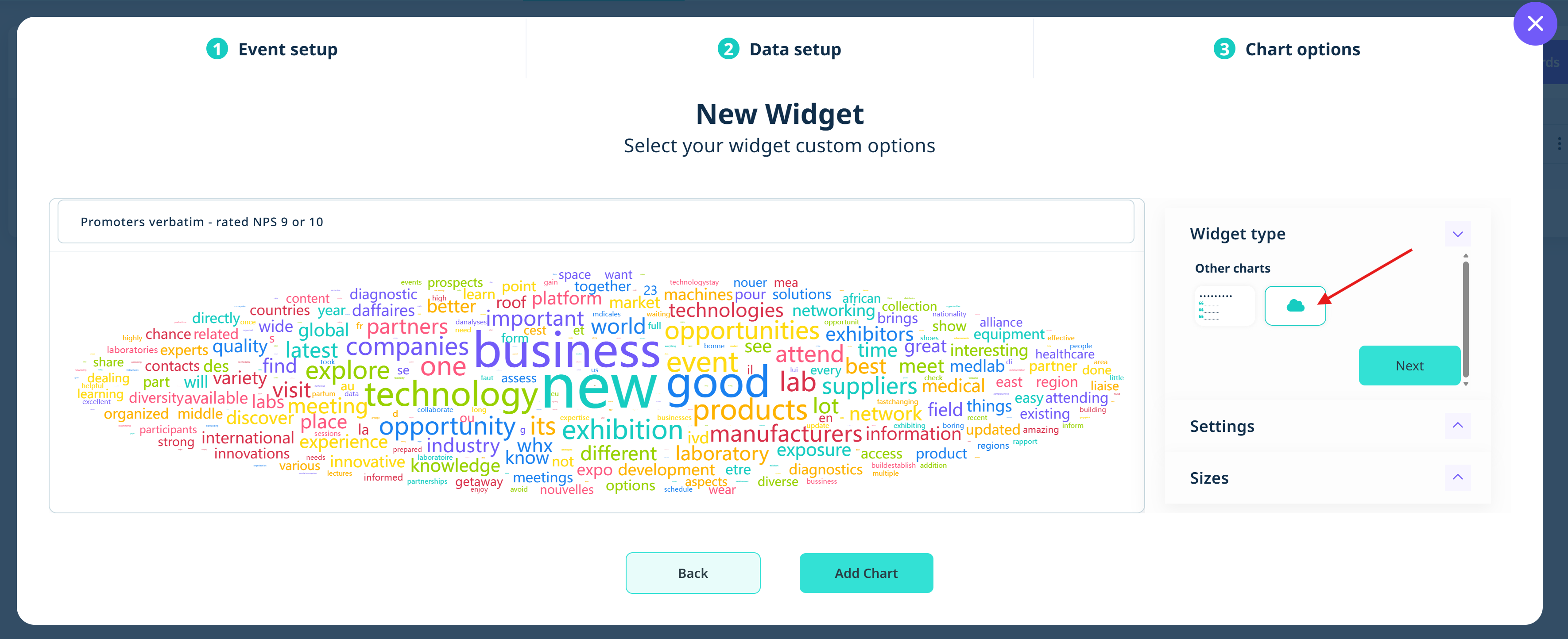
4. On the next page, under widget type, select the open text chart you would like to use
5. Re-size the widget to your satisfaction
Adding filters to your Dashboard
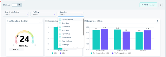
Filters can also be added to your dashboard to drill down on more specific data points, making it easier for you to visualise the metrics that matter most to you. You can apply multiple filters at once to quickly compare different viewpoints. If you would like to add filters to your dashboard, please contact your Explori lead.
Save your Dashboard as a tab
For easy access, on the 3 dot menu, you can save the dashboard as a tab so it will appear at the top of the dashboard screen. This is also where you can save the dashboard as a template to use across your different portfolios/events.

![]()