Explori Dashboards turn your survey data into clear, visual performance summaries, giving you an overview of how your events are performing and how results compare over time.
Dashboards highlight the metrics that matter the most, at event, portfolio or company level, so you can identify trends, benchmakr performance and make informed decisions quickly.
The dashboards include pre-built templates to get you started and are also customisable, so you can access information that you need most.
Availability
- Available to all users with access to the Explori platform
- The events visible within your dashboard depend on your user-level access so you will only see events you have been granted permission to view
How to access and use the Dashboards
There are several ways to navigate to your dashboards:
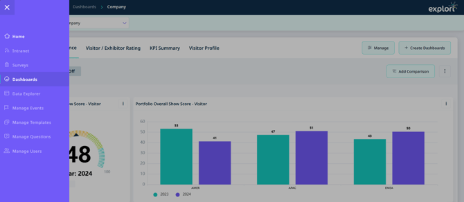
- Select the dashboards icon from the main navigation menu
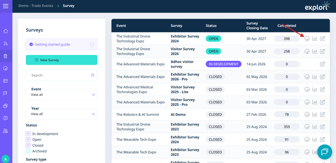
- Select the dashboard icon located beside your survey in the survey list
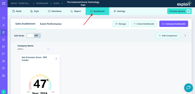
- Select the Dashboard tab when viewing an individual survey
Tip: If you are already viewing an event-level dashboard, select 'Company Dashboards' at the top of the page to return to the company-level view.
Event level dashboards:
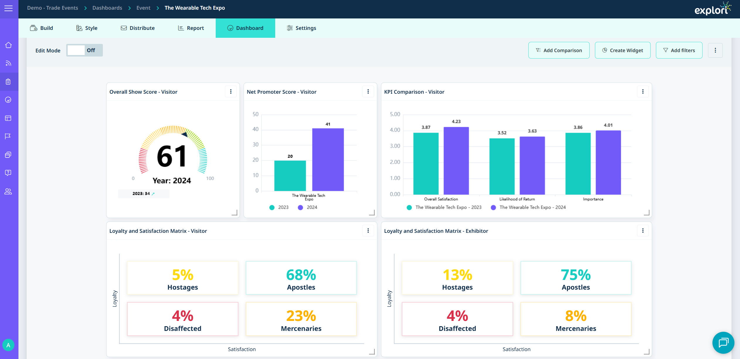
The event level dashboard provides a focused view of how a single event has performed.
Key metrics displayed:
- Overall Satisfaction - how satisfied attendees were overall
- Net Promoter Score (NPS) - the likelihood of attendees recommending the event
- Likelihood of Return - whether attendees plan to attend again
- Importance of Event - the perceived value of attending (shown as Value for Money in consumer surveys)
These four scores combine to produce your Overall Show Score.
At the bottom of the event dashboard you will find a Loyalty vs Satisfaction matrix. This splits attendees across four groups to help you understand engagement and loyalty patterns across your audience.
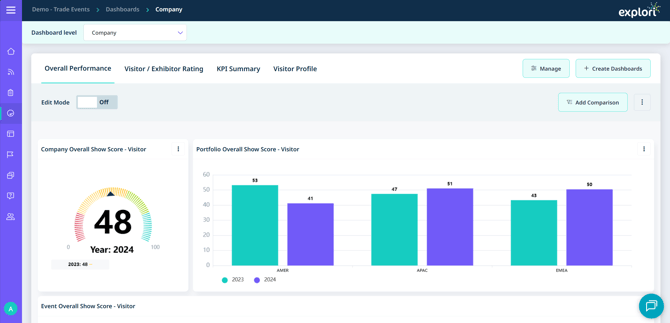
Company & Portfolio Level Dashboards
The company dashboards will show you the overall performance of your events. You will be able to see all of the events that you have access to on the platform.
At the top, you will find different tabs for the default dashboards we have created for you which will give you a KPI Summary based on your selection.
![]()

You will also get a similar summary for your portfolio level dashboards
![]()
