Quadrant Analysis can be accessed via Explori Dashboards and allows users to plot KPIs on a customisable graph along with the ability to use some exciting new data visualisation tools.
Like the other dashboard views, you will have the ability to switch between the different event types that your company organises:
Expos: Trade, Consumer, Conference, Virtual Event
Corporates: Internal, External, 3rd Party Exhibit
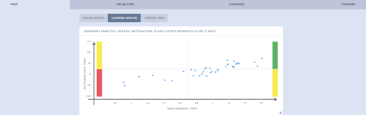
To start using Quadrant Analysis, click on the graph to zoom in and start customising the view you get.
When using Quadrant Analysis you have the ability to filter on portfolios, events and years - by default, all portfolios/events are shown for the current and previous year, if available.
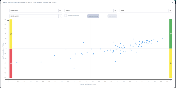
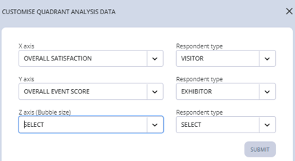
By clicking 'Customise Data', you are able to change the questions (or data) that is being plotted on the graph.
X axis - the horizonal direction of the data, where lower performing events will be on the left of the chart, and higher performing events will be on the right of the chart.
Y axis - the vertical direction of the data, where lower performing events will be at the bottom of the chart, and higher performing events will be at the top of the chart.
Z axis (if selected) - the size of each bubble, where lower performing events will have a smaller bubble, and higher performing events will have a larger bubble.
Quadrant Analysis allow for direct comparisons of KPIs between both visitor and exhibitor surveys, allowing organisers to easily see a clear picture of event health for the two main customer groups:
In addition, users can click-and-drag on the chart to select a segment of the graph which may be of interest, and then enable 'Show event names' to more clearly see the shows in that segment:
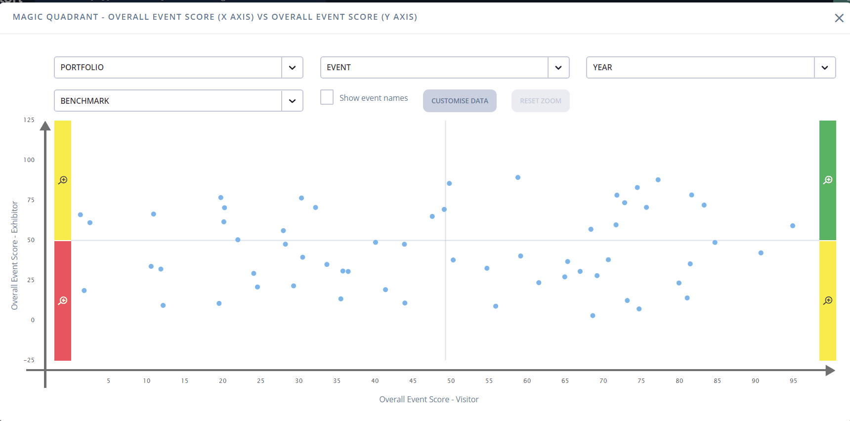
Alternatively, you can use the coloured corners to zoom in on just that quadrant:
-gif.gif?width=660&name=MQ%20quarter%20zoom%20(2)-gif.gif)